If, by some amazing chance, you've missed out on the drama surrounding The Winner's Kiss cover, allow me to fill you in. Last Friday, a post appeared on Twitter regarding The Winner's Kiss, the final book in The Winner's Curse trilogy. On this sad day, Fierce Reads announced that the entire series was being released with redesigned covers... and the last book isn't even out yet.

An incredible amount of backlash followed this announcement. Readers everywhere lamented the loss of the beautiful cover that had ALREADY BEEN DESIGNED for The Winner's Kiss hardcover. Apparently, Fierce Reads replied with the comment, "The red dress is not happening, we wanted Kestrel to look as bad*** as she is so we thought a redesign was in order!" This went on to incite much rage from fans who could not understand why a woman could not be a badass in a dress. Much has already been written about that topic (great post here), however, and that's not what this post is about.
This post is to remember all the beautiful covers who have fallen to a way less awesome redesign. Of course, the awesomeness level is completely subjective. Personally, I'm not quite understanding why covers must be changed at all. Perhaps it's just to reach a wider audience. Either way, it makes me sad.
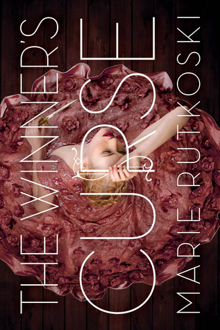
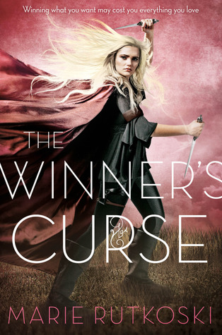
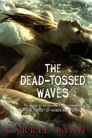
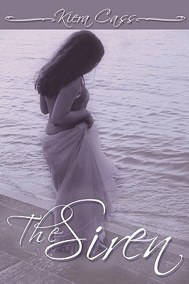
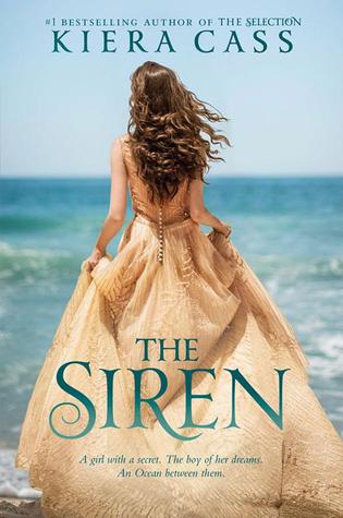
Three terrible cover redesigns
(in my humble opinion)

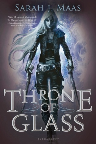


Three amazing cover redesigns


These are just a few of the best and worst cover redesigns as I see it. Would you add any to the list?
And most importantly, what do you think about The Winner's Kiss debacle of 2015??